Masonry Layout with three lines of CSS
The masonry layout consists of a group of elements of unequal size, arranged in such a way that there are no uneven gaps. A clear example is the Metro menu in Microsoft Windows.
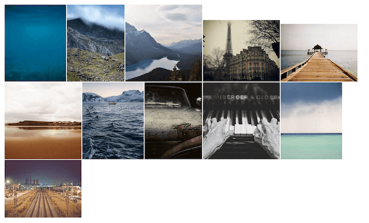
The following code example shows a set of images of different sizes.
<div>
  <img src="https://picsum.photos/seed/random10/320/400.jpg" />
  <img src="https://picsum.photos/seed/random20/300/400.jpg" />
  <img src="https://picsum.photos/seed/random30/400/400.jpg" />
  <img src="https://picsum.photos/seed/random40/400/320.jpg" />
  <img src="https://picsum.photos/seed/random50/400/300.jpg" />
  <img src="https://picsum.photos/seed/random60/400/400.jpg" />
  <img src="https://picsum.photos/seed/random70/320/400.jpg" />
  <img src="https://picsum.photos/seed/random80/300/400.jpg" />
  <img src="https://picsum.photos/seed/random90/400/400.jpg" />
  <img src="https://picsum.photos/seed/random100/320/400.jpg" />
  <img src="https://picsum.photos/seed/random110/400/300.jpg" />
</div>
This is what the images initially look like on screen:
The three lines of CSS to apply are the columns, gap and width properties.
The CSS shorthand property columns sets the number of columns to use when drawing an element’s content, as well as the width of those columns.
The CSS shorthand property gap defines the spaces between rows and columns. This property applies to multi-column, flexible, and grid containers.
The CSS width property defines the width of an element. By default, it defines the width of the content area, but if box-sizing is set to border-box, it defines the width of the border area.
div {
  columns: 320px;
  gap: 4px;
}
img {
  width: 100%;
}
These values have been used for convenience. columns: 320px, gap: 4px, and width: 100% are equivalent to the Tailwind CSS classes columns-xs, gap-1, and w-full. The four pixel spacing is the default browser spacing between images when the columns property is not set. Giving images a width of 100% will make them fit properly within their column width.
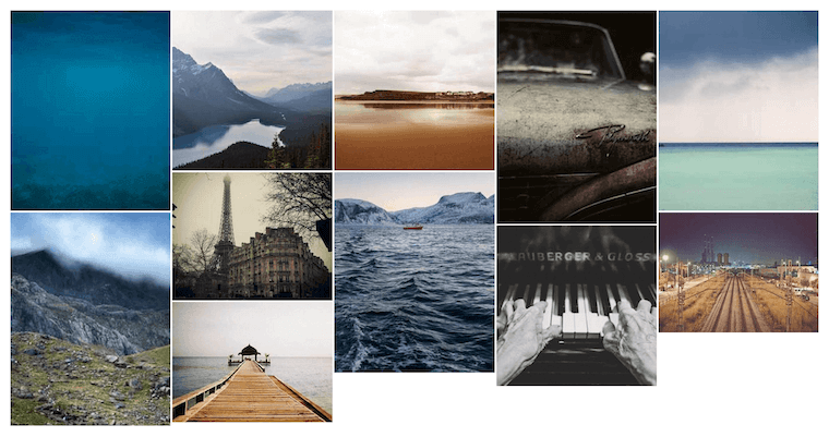
Images now automatically reorder to fill the available space between them.
This is what the images look like after applying them:
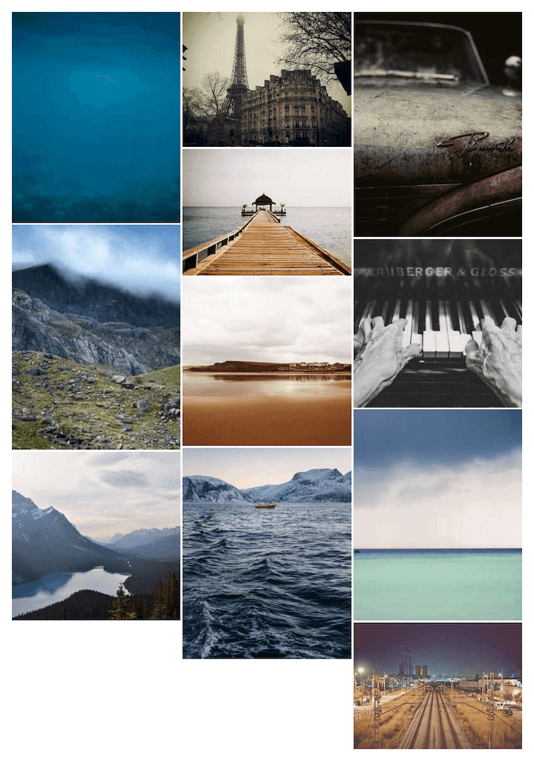
The design even adapts to different screen sizes and orientations:
Thanks to the advances of CSS, a complex design that previously required multiple lines of CSS, in addition to the use of JavaScript, can now be implemented with just a few lines of CSS.
Written by Samuel de Vega.